Garrett Griffin-Morales
This article covers the high points of creating user-selectable themes when enabling San Diego’s Next Experience. While this mostly covers color selection for themes, it should also relate to other theme style properties. See ServiceNow documentation for more detail.
You can also use this information to create variant styles (which will show as theme selections for users) within the default “Polaris” theme.
Note: San Diego patch 1 or later is needed for all these steps to work.
Workspaces: The author experienced mixed success with this method in workspaces. At times, such as on longer page loads, the workspace UI would go back to the Polaris default, and the preferred theme would have to be chosen again by deselecting and then reselecting it in the Theme preferences.
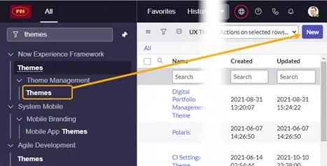
Create a new Theme
Now Experience Framework > Themes > Theme Management > Themes
(FYI, one of the themes listed is “Polaris,” the default theme for the Next Experience. We are going to override that in a later step.)
- Click “New.”

- Give it a name and click “Save”
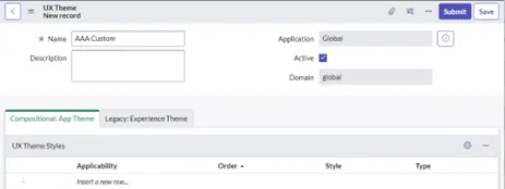
Create a new Style record for the new Theme
- On the new Theme record’s “Compositional: App Theme” related list, click on “Style” and click its magnifying glass.
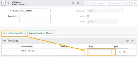
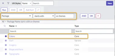
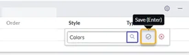
- In the pop-up window that displays, search for UX Styles named “Colors.” If there is more than one listed by that name, filter the list for: ‘Package’ starts with ”sn-themes,” then select “Colors.”
- When the pop-up window closes, click the green “Save” button to keep the selection.
- Save the theme so the style will be kept on it.
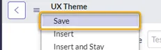
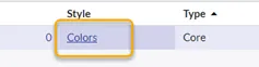
- Click on the “Colors” style to open it up.
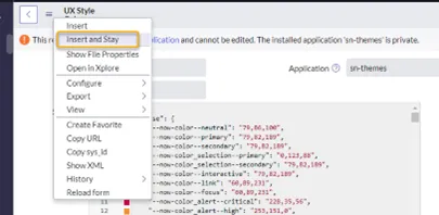
- Right-click and select “Insert and Stay” to make your own copy of the Colors UX style.
-
Now it’s time to customize.
-
Name: You may change this to easily recognize this style record.
-
Style field: Don’t be overwhelmed by the long JSON file. Just updating one or two colors can have a big impact. These two lines might be good starters in the “base” section at the top:
-
“ - now-color_chrome - brand”
“ - now-color_chrome - divider”
You can search for RGB color codes online to find the values for the colors you want.
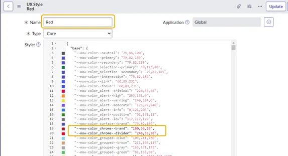
NOTE: The code must remain properly formatted for JSON, or a blank page with no frame may show if this style is used.
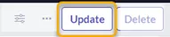
- Click “Update” to save the file and return to the Theme.
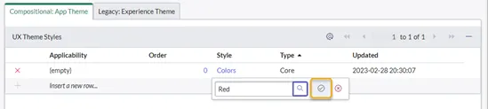
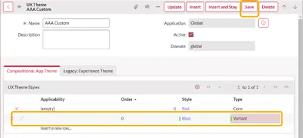
- Back on the Theme, the default Colors style is still listed, but not the one that you just updated. Double-click in the row below the “Colors” style to locate and add your new color style. Click the green arrow.
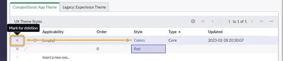
- Then remove the original Colors style that was copied by clicking the red “x” for its row. (This will not delete the style from the system, but only remove it from this theme.)
- Save the Theme to keep the changes.

- Your custom style should be the only style listed.
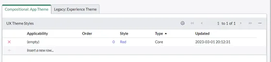
NOTE: This example uses your custom style as the “Core” style for this theme, but you could have left the Colors style in place as “Core” and added the new style as a “Variant.” More information on that is below after the “Refresh your browser” step.
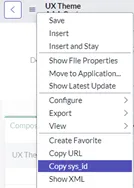
- Get the sys_id of the theme to prepare for the next step.
Create a system property entry for the custom theme
This will make the theme’s “core” style become the default for all users.
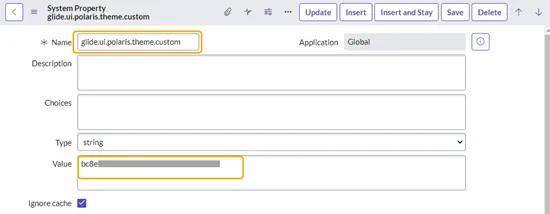
- On the sys_properties list, open a new entry
Name = glide.ui.polaris.theme.custom
Value = sys_id copied from the Theme record
- Click Save
Refresh your browser
After refreshing your browser, the system should use the new theme instead of the Polaris theme because of the system property that was added.
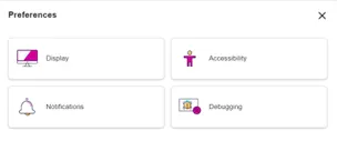
- You may notice that there is no Theme selection visible in the Preferences. This is because at this point there is only one Style listed in the new Theme.
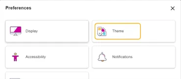
- To provide theme selections for users: Add other styles to your theme, but as Type = “Variant.” Do not forget to save the Theme record after you have added Style entries to it. You can also add existing variants to your theme, such as the Dark variant. (Note: The Dark theme only works when the system property “glide.ui.polaris.dark_themes_enabled” is set to “true.”)
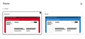
- The Theme selection should then appear under Preferences, and your default and variant should appear as theme selections. You can add multiple variants.
BONUS INFORMATION
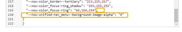
There are other properties you can set up. For instance, if you want to hide the wavy background pattern used by Polaris, add this to the JSON properties of your style:
“ - now-unified-nav_menu - background-image-alpha”: “0”
Don’t forget that if you add this as done below, you’ll need to add a comma at the end of the previous line.
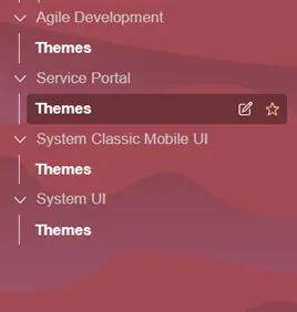
Before (with pattern showing):
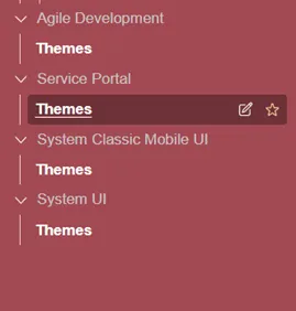
After (with pattern hidden):
That’s all for this article. Happy Theming!