
The Utah release brings a couple of nice changes in the area of theming. The Dark Theme applies to more screens in the UI, and a new Theme Builder app provides an easier way to brand your instance. The Next Experience still allows you to make good-looking custom themes with some effort, but using the theme builder means you don’t have to dig into the system if you want to change the appearance of your instance for all of your users.
Most of this article will be spent on the Theme Builder, but let’s go over a couple of other things first:
Dark Theme Improved
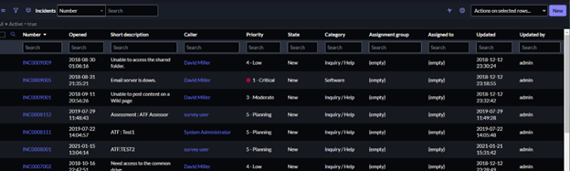
Before Utah, the Dark theme applied to workspaces but not so much to classic UI screens. Utah’s Dark Theme also applies to classic lists and forms, such as in this example screenshot of a list of incidents.
Still, not all types of screens are affected by the Dark Theme. For example, the plugin page (“plugin” in the navigator) still shows a white background.
User Selectable Themes
Theme Builder is used to create a brand that will be used for the entire instance. If you want to allow users to choose their own themes, Theme Builder does not provide that ability at this point. To make user-selectable themes in Utah, you still need to follow the steps in the article “Quick Theming for the Next Experience”*.
Theme Builder
Theme Builder is a store application for Utah that is used to brand the instance. It provides an easy way to build a theme without relying on other websites for color matching or without you having to find specific records for styling to manually update. It can match your company’s branding or make your sub-production and production instances visually different.
Getting Started
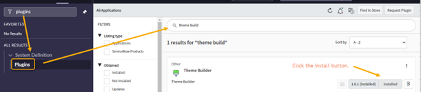
- Download the store app. Search for “plugins” in the Navigator, then for “theme builder.” Click the “Install” button.
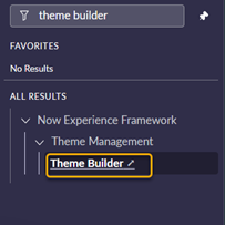
- After the application is installed, search for “theme builder” in the Navigator and open the app.
- Before proceeding, be aware that:
- Only one theme can be used at a time since it is for the whole instance.
- If you update a theme that is currently in use, you are changing it live for the instance. Be careful of that on production!
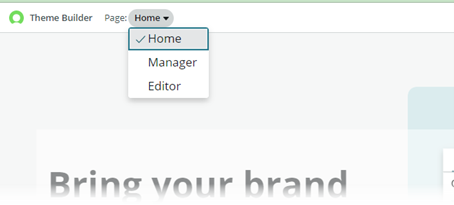
Selecting a Page
The Page dropdown is how you navigate to manage or edit themes.
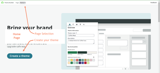
- Home – the entry page from which you can create a new theme.
- Manager – the page that lists the different themes on your instance. From here, you can select a theme to “Apply” (which makes it the active theme for your instance), Edit, or Delete.
- Editor – the page on which you can make changes to a theme.
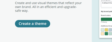
Create a Theme
We won’t look at all of the screens the Theme Builder uses to guide you through the creation process since they are mostly straightforward. You can click “Create a theme” from the Home page and go from there.
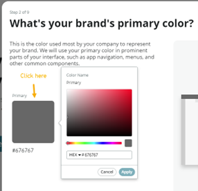
When asked to pick colors, click on the color tile. A color picker will then display.
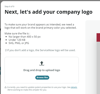
One of the steps lets you add a logo. The image will have to meet certain requirements, which will be listed in the step. If you don’t have a logo ready, you can edit the theme in Theme Builder to add one later.
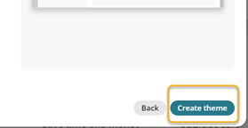
After you review other screens for color, font, and styling selections, the final screen offers another button to “Create theme.”
Edit a Theme
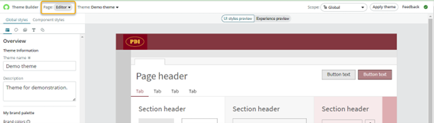
The new theme will then be shown in edit mode, with the Page dropdown set to “Editor.” This page is where you can make customizations.
Edit Page – Preview Pane
The large preview pane on the right has two tabs:
“UI styles preview” displays a preview of the style settings selected in the left pane.
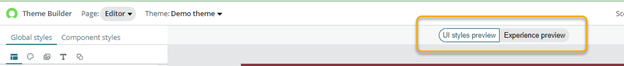
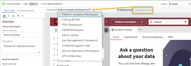
“Experience preview” similarly uses the left pane’s style settings to show a preview of how they appear in various workspaces, which you can select from the “Experience” dropdown.
Edit Page – Styles Pane
The styles pane on the left also has two main tabs:
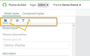
“Global styles” is the place where you make the display customizations.
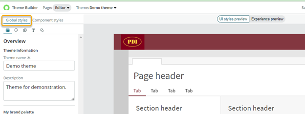
It might be easy to miss that the Global styles tab has a few subsections represented by small icons at the top of the page: Overview, Color, Imagery, Typography, and Shape. Select each one to see its options.
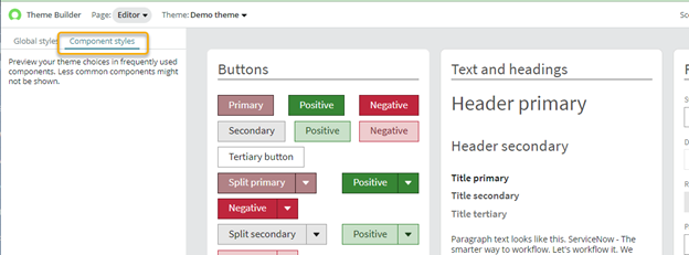
“Component styles” is a tab that switches the large preview pane to a detailed display of buttons, fields, etc., of the styles that were selected.
Saving Changes and Applying a Theme
You do not click anything to save your work. Changes are saved as you make them, so your users will see the changes if the theme you edit is in use!
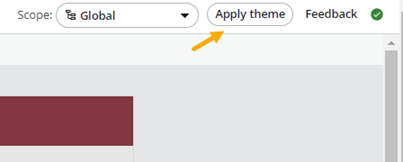
You can make several themes in Theme Builder, but only one at a time will be in use across the instance. When you are editing a theme, you can click the “Apply theme” button on the upper right to make it the new “applied” theme across the instance.
Theme Manager Page
When the “Manager” page is selected from the Page dropdown, the themes on your instance are listed.
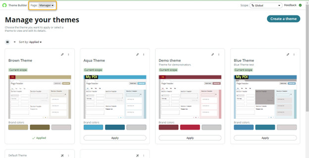
You can select a theme to edit, delete, or apply. The theme that is marked “Applied,” such as the “Brown Theme” theme in this picture, is the one your instance is currently using.
To put a different theme in use, click the “Apply” button at the bottom of its tile. A prompt will ask if you want to continue, including a warning that it will become visible right away to your users.
Conclusion
Utah’s Dark theme is a nice improvement for users who want it for classic forms and lists, and Theme Builder can be a time saver if you want to make quick changes to an instance. Theme Builder is also useful if you feel uncomfortable manually creating custom themes for your instance.
